Nutritionist - Identity Design
Logo and identity design for nutritionist Φινέ Ιωάννα (Fine Ioanna) located in Athens, Greece.
She wanted to convey her values, establishing a strong position in the market.
In order to achieve this goal, I was commissioned to create the identity of the company.
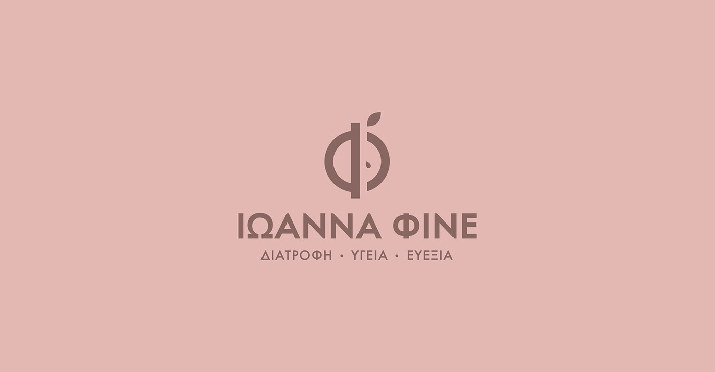
The symbol design was inspired by the shape of half an apple and from the greek letter “Φ”. The design approach combines a minimalistic - geometric design of the fruit and the form of the “Φ” which is the initial letter of her surname (Φινέ/Fine). The result is a strong and recognizable symbol. The letters of the logotype, following the design of the symbol, have the same aesthetic approach. The logotype radiates the profile of a solid, modern and extroverted company. The pinkish/blush colour resembles emotional healing, calm, affection, caring, and nurturing. The brown colour is a comforting color and symbolizes a wide range of emotions, such as friendships, earth, hearth, home, outdoors, reliability, credibility, comfort, endurance, stability, simplicity, tranquility, nurturing, contentment, strength, generosity, practicality, and hard work. So both colours emphasize the brand's purpose.